Anatomy of a Logo
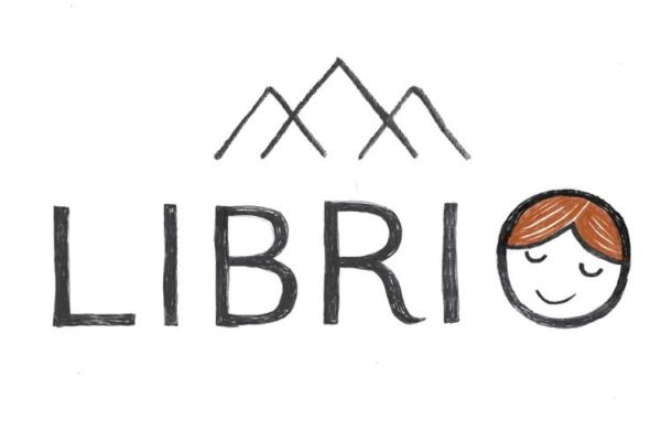
Pretty much everyone I’ve handed my business card to so far has said “Hey, I love the logo” and I like to think that’s because they genuinely do rather than because it has a smiley face in it and they feel compelled to say something nice in return.
How on earth are logos born?
I’ve always been fascinated by the logo design process. It’s a sector of design so abstract that it’s astonishing to me that any end product comes out at all.
If I say “draw me an illustration to go with Elena walked up the mountain towards the dragon”, that’s something to go on. Even I can come up with something for that. But this is what I (genuinely) gave to Nick as the brief:
Make something:
– Techy but bookish
– Modern but timeless
– Childish but sophisticated
– Professional but whimsical
Whaaaa? Where to start? I really would have been fine if he’d come back five minutes later with this.
So, follow me on the journey of how we went from that preposterous brief to the beloved smiley logo at the top of the page.
Getting in the mood
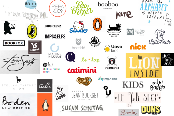
First, Nick put together a Mood Board of logos in the same field. Mainly children’s publishers and clothing brands. Here it is:
Looking at the board, I was surprised that there weren’t any where I thought “Yes, make a logo like that one”. I like the Uovo Kids one, but we’re not egg themed. I like the hootkid one, but a random animal didn’t seem appropriate. Most of them were too whimsical, too animal-themed or too straight for what I was looking for. Funnily enough, I imagined “How would it feel to hand out a business card with this logo on it and how will people react?”
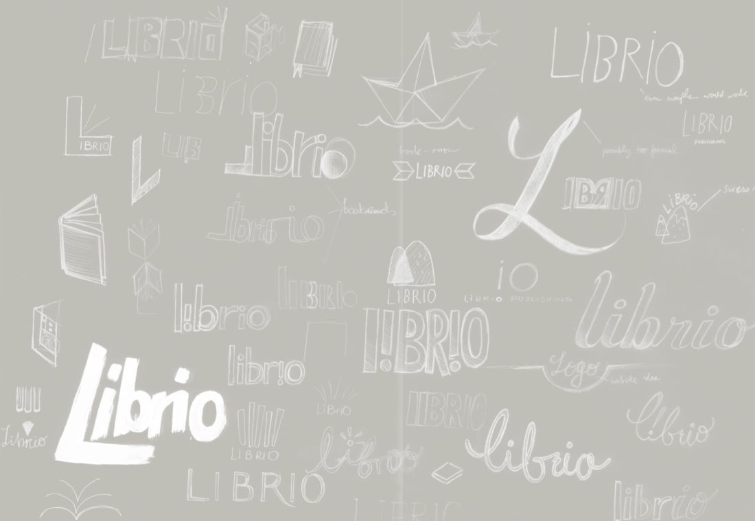
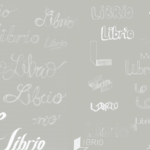
Contrary to my lack of inspiration from the mood board, Nick used these to get the creative juices flowing and starting sketching out some ideas. You can’t read them so well in the images, but I like his notes here, you can really see the process going on in his mind as he starts to throw things down on the paper. Things like “Swiss alps”, “Bookends”, “Too conservative” and “Doh! ‘r’ missing”.
There’s no such thing as love at first sight
At the end of the process, Nick narrowed it down to the following 8 logos:
My initial reaction was that I’d enjoyed the journey through the Mood Board and the Grey Papers (TM) more than I enjoyed the destination of the eight logos in front of me. None of them really shouted “Pick Me!” and, without a particularly solid idea in my mind of what it was I was looking for, it wasn’t easy to give productive feedback. My thoughts were:
Logo 1. I really like the book / alps imagery, but it looks like a bank logo with that font
Logo 2. Looks nice, but can’t read it
Logo 3. Kind of fun, but doesn’t do much for me other than remind me of the Pathé logo
Logo 4. Although I really wanted to avoid book references, I like this one. It’s a little too close to the border of “Scribbly, looks great” and “Scribbly, looks unprofessional” for me. I also didn’t want any English in the logo
Logo 5. Aesthetically, this was my favourite, but I didn’t know what it was meant to mean
Logo 6. I had no idea what Nick was thinking with this one. Library, maybe?
Logo 7 & 8. A bit illegible if you don’t know what it says.
Somewhere between excited and disheartened, I had a call with Nick and shared my feedback. On number 6, he’d been going for a more classic book-related feel and liked the font. “I could trace the font so it looks less formal, maybe.” This intrigued me. Traced font sounded fun and so he set about round two of the process and I began my obsession with traced fonts.
Hooked on a (traced) feeling
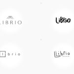
Nick took our discussions on board and refined the logos before producing Batch 2.
These were all vast improvements on the previous batch. I fell in love with the two traced-font mountain-themed ones and, in a way these processes can somehow surprise you, I found myself most liking the one where I’d originally thought “what was Nick thinking?”, namely Logo 6. I loved the traced classic font with the stylised mountains made of open books – Mountains because we’re based in Switzerland, of course.
My wife, Olivia, was of a different opinion. “The L looks like a claw. It looks really aggressive”. I had to grudgingly agree that we were designing a logo for a children’s publisher, not a Wild West saloon. And so Number 6’s journey was over.
However, I loved the combination of professional yet playful that the traced fonts provided, so my obsession with them remained and we focused on the old “bank” logo number 1. Of the eight adjectives I’d given Nick, namely: Techy, Bookish, Modern, Timeless, Childish, Sophisticated, Professional, Whimsical, I felt it hit 5: Techy, Bookish, Modern, Sophisticated, Professional. He’d even added “Swiss” in there for good measure. But it was missing two very important elements for a children’s publisher: Childish and Whimsical.
A good logo is like a good joke
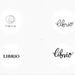
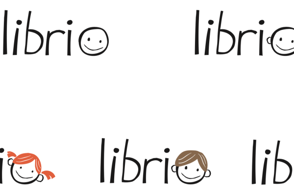
Then it came to me one night while holding my sleepless son: smiley face! Lighten up the logo with a smiley face! I couldn’t wait to get online to Nick the next morning. Here I was, the first person ever to think of making an O into a smiley face and it was going to bring the final element to creating the perfect logo! I think Nick’s comment was “it’s probably going to look rubbish, but it might be genius.” Hours passed before he sent me this.
No, that’s not what I wanted at all. This was a completely different style we hadn’t even discussed before. I wanted the Techy, Bookish, Modern, Sophisticated, Professional one with a smiley face. Finally it came and I loved it. We had covered every element you could possibly imagine in a logo.
Sadly, I had to ask the opinion of other people and, without exception, they all preferred the original smiley face you see sitting at the top of the page. I had to detach myself from the all-elements-in-one logo and realise the simple truth that
A good logo is like a good joke. If you have to explain it, it’s probably not very good.
Everyone I’d sent the logo to, I’d put in brackets “the mountains represent books”. In other words, I had to explain it, ergo, it wasn’t very good. Looking at it a couple of months later, though, I still really like it.
O is for Oli
And so we arrive at our logo journey’s end. Once I gave up my attachment to Number 1, I realised how the final logo perfectly encapsulates the feeling that I want the brand to impart in people. Focusing on one central emotion was so much more important than trying to pick a logo which contained several subtle messages. Furthermore, this logo was a brand I felt happy and proud to be a representative of; professional, playful and welcoming.
So there it is, the journey from ridiculous brief to smiling logo. The O character is called Oli and If Oli’s smiling face endears people to our products as much as it endears people to our logo, then we’re off to a good start.



Georgina Donaldson
April 6, 2017 at 7:52 pmFascinating and made me laugh. Think you chose the right one – I like Oli
🙂
Gillian MItchell
April 12, 2017 at 9:54 ami love the happy face, it really is rather contagious. well done.
Pingback:Kikisoso Design & Letterpress | Logo design for Librio.com
April 12, 2017 at 11:26 amSharon Smith
November 2, 2017 at 10:29 amAmazing and interesting post!
Really good logo is good joke. I always like simple logo, simplicity is the best and complexity is worse always.
Arina Petrova
February 6, 2019 at 2:35 amWhat’s the designer’s full name?
Ed Russell
March 20, 2019 at 8:21 pmHi Arina,
It was designed by our in-house art director, Nicholas Elliott.