Always judge a book by its cover
5 minute readDon’t forget the cover
Around about this time three years ago, Librio was putting the finishing touches to our first book, The Tree, The Key & Me. We’d never made a children’s book before, let alone a personalised children’s book and things were… somewhat hectic. We were learning first-hand that the cliché “It’s harder to make a children’s book than it looks” was very much true and at the same time learning that the non-cliché “It’s harder to make a personalised children’s book than it looks” was even truer.
Amidst the mad rush to get the book finished on time, we genuinely almost forgot that we needed to design a cover as well. With the clock ticking down and every day’s delay costing us precious funds for survival, we squeezed out the cover for our first book in about 24 hours from initial idea to finished, personalised version.

Given the time constraints, we’re still pretty happy with how it came out, but now that we’re putting the final touches to our seventh book, we thought we’d give you an insight into how the process has changed over the years and how much thought and energy goes into creating one of our covers.
The Brief
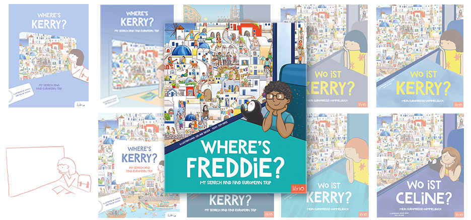
To create the cover for the follow up to our bestselling search-and-find book, we could have just gone the easy route and made a new version of the existing cover. Change the colours around a bit and bob’s your uncle. Here's the original.

However, we wanted to freshen things up a bit and make a cover which was a little bolder than the previous version. Luckily, we had a new product designer, Kerry, on board and her first task was this somewhat tricky brief:
The new cover should:
- Show the child and their name prominently
- Let people know it’s a search-and-find book without resorting to the same design search-and-find books always use, which we find somewhat un-modern.
- Resemble the first cover, but not too much
- Find a way of combining bold, simple design with the complexity of a search-and-find illustrations.
- Give the impression of a train journey
Easy peasy.
Kerry went away and came back with some ideas which we put to the team.


The one which really stood out was the one with the train window element. This might allow us to have bold colours around the window and show the search-and-find through the window. We were on our way.
The table
It’s funny to look now at this basic sketch and see how it transformed into the final cover we see today. So, let’s go through the steps. The first step was introducing the table element. This gave a bit of structure to the image, but we weren’t too sure about the title being all the way up there, it all felt a bit detached.

Then one day, Kerry said “I’ve done something rather radical, let me know what you think”.

Wow. The table changed from giving a bit of structure to becoming a defining feature of the cover. This resembles far more where we ended up now. From this point on, it was basically a case of trying version after version after version until we refined the design.


The child
Next, it was time to involve Celine, the illustrator, who would illustrate the child in her style into the cover. Her first comment was “the child is looking away, they should be looking more to the front.” Point taken. And we needed a chair to show she was on a train. We asked Celine to sketch a child in her style into the cover, so we could see how it looked and we added some bold colouring to see how that would look. Celine also added the penguin, which we’re big fans of. In the end, we didn’t like the bold colouring, so we toned it down a bit and ended up with the one on the right as our preferred version.


The survey
There was still some concern internally that the cover was too different to the original and wouldn’t resonate with our customers, so we sent out a survey to friends, family and some of our biggest Librio fans to see what they thought. The brand new version vs a more “traditional” search-and-find layout. Luckily, the new version won. Phew, we were on the right track.


The colours
We felt we were close, but something wasn’t feeling quite right, so we turned to Ness, our picture book design consultant. Her comment: “The colours are a bit muted and remind me of Sweden. It’s a children’s book, let yourselves have a bit more fun with the colours. Here's a very rough version!”

This was a vital catalyst to help us realise that we could offer the cover in multiple, fun colours rather than just choosing one. That along with our Art Director, Nick, pointing out that the title and table need to be centred and less high (sorry, two silly examples here from a chat late at night…) and we were basically done.
")

All it needed now was for Celine to draw in the character properly (in the same position as on the original cover, which nobody's going to notice unless we point it out), clean up some lines and, voila, our finished cover.

We hope you like it as much as we do. It’s been a fun journey creating something which we feel is very different to other search-and-find books and feels modern, fresh and exciting.