You’ve Got To Have A Little Bit Of Style
5 minute readI never watched Thundercats when I was younger. It seems to be the one show that I’ve been asked if I remember more than any other. But I don’t, because I never saw it. If I think back to the TV I watched with my three sisters, there is one show that stands out miles above all others: The Wind In The Willows.
No aliens, no space ships, no thunder and, weirdly enough, no cats. Just good old British countryside fun and some very fine voice acting by the likes of David Jason.
Thirty years later, there is one song from that series that’s been going round my head for the last two months. Here it is:
Hilarious, isn’t it? (…)
A Dog with Wings
It’s been going round my head, because we’ve been thinking a lot about what style our first book should be. I was always pretty sure that it would be a mix of the traditional children’s books I grew up and the contemporary books my daughter is growing up with.
To get a feel for what this would look like, I asked Nick to knock up a couple of images around the theme of a friendly dragon. This is because the night I’d had the thought for Librio in 2014, I thought of the sentence “Elena walked up the mountain towards the dragon”, so it seemed a good place to start.
“Dragon?” Said Nick, “That’s a really hard thing to draw. Can’t we do a dog instead?”
“Elena walked up the mountain towards a dog?” Hmm, no.
As it turns out, “Drawing a dragon is kind of like drawing a dog with wings and a long tail”.


I loved the images. Seeing them was my first real moment of excitement on the Librio journey.
Mission Accomplished
We took the images to Bologna and compared them to many of the world’s most renowned illustrators and I felt very happy with what we already had in the bag. I actually genuinely liked Nick’s sketches more than much of what we saw at the children’s book industry’s premier trade show for illustrators.
Job done.
Except, the next week we showed them to a couple of veteran editors in the field with decades of experience between them. They did not like the illustrations at all. One of them described them as “Derivative of Oliver Jeffers, but far less accomplished”. Ouch.
I am new to this. We are new to this. Every bit of advice from everyone who is not new to this is of extreme value to us. We were advised “Think long and hard about your artistic style, it may well be the most important decision you take”.
Cue Montage
So we thought long and hard about it.
We wanted to explore different options, but we had to keep true to Nick’s core style. “Everybody’s digital now, you should be too,” we were told. Digital is a long way from our original vision of watercolour, and wasn’t really on the cards for us, not least because it was a medium Nick had never used before.
Then, out of the blue, Nick sent me this one evening without any comment.

Why’s he sending me this Benji Davies image? Oh. Ohhh, I see. Hmm, maybe Nick can do digital too. This wasn’t a bad effort at his first foray into digital artwork. Here’s the original for comparison.

We headed down the digital path. Nick categorised popular digital styles and put them together in this nice little summary.

We opted for the three on the left. Mixed media is super interesting, but it didn’t feel quite right. We then added the traditional watercolour as an option, as that was what we intended in the first place. Nick came up with three images. (We dropped Gouache as it looked a little, well, Rubbache).
We put together a little survey and sent it out to our network. I was hoping for 25 responses. Somehow, we got 143, which I still can’t quite believe. THANK YOU, everyone.
You can fill it out if you like, but nobody’s going to look at your answers.
As happens with many enterprises, artistic and otherwise, looking at this quiz with hindsight just annoys me. I find the images, the subject matter and the quiz format utterly boring compared to where we are now. However, it was a very important process for us to go through internally, it really made us think about our style and develop one most suited to us.
For the record, all three images scored pretty well. The most extreme opinions, both good and bad, were for Digital Indie. The overall winner was my own least favourite, Digital Polished.
These are the images which appeared in our dummy book from the printers and they do all look great printed out, so I’m super excited about how our actual spreads are going to look.
The Final Countdown
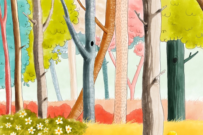
Our style is now fixed. It’s best described as Digital Watercolour. It suits us perfectly. The trees at the top of the page are from one of our spreads. These animals live in that forest. Little by little, we move away from Abstract Librio and towards Concrete Librio. Exciting, but progressively scarier.

In fact, today in three weeks. Watch this space.
To keep you busy until then, it’s incumbent upon me to point you in the direction of some of our favourite bits of Toad. Now all I need is a cup of tea and a slice of fruitcake.
No Comments